Brands often think that customers are attracted by salesy & show-off packaging designs, but that’s not always true. Minimalist packaging designs are yet powerful enough to capture customers’ attention, increase sales, and scream luxury quietly.
Gone are the days when a fancy packaging approach was liked by customers. Now trends are evolving day by day, and today customer demands originality instead of just showing off.
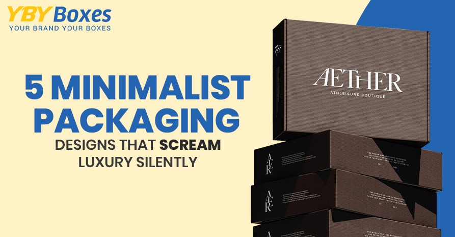
Here, we present 5 minimalist packaging designs that showcase luxury while being budget-friendly.
5 Must-try Minimalist Packaging Designs for an Appealing Look
Minimalist design focuses on simplicity, functionality, and clarity. This type of packaging is associated with balanced use of colours, fonts, and other customisations.
Why brands switch to minimalism? It removes clutter and conveys the necessary information that customers want to know before making a purchase.
Let’s discuss how these 5 minimalism designs work best for an appealing look.
1. Monochromatic Design Theme
Most minimalist packaging designs come in a single colour palette. When customers see a lot of colours on your product packaging, they normally get distracted and confused. The use of a single colour can attract them due to its elegant look.
While using a monochromatic design theme, make sure your brand identity visuals match it. Maintain a consistent brand identity using a simple colour that complements your brand identity.
2. Transparent Design
Customers love buying those products that come in transparent packaging so they can easily see the inside of the product without unboxing it. And what could be more impressive than a transparent design on custom-printed boxes?
Not only does it enhance luxury aesthetic appeal, but it also convinces customers to buy. You can include any type of customisation on transparent design boxes or bags, like a bold brand name or logo.
3. Vintage & Retro Design
Old versions never go out of style, and this is the reason such design elements are still trending for minimalism. Vintage & retro design elements provide a nostalgic feel through classic fonts, neutral colours, and decent themes.
This type of minimalist packaging design is a perfect way to give a premium feel without creating cluttering issues. Hence, the purpose of minimalism is fulfilled when clutter is eliminated from packaging.
4. Ample White Space Design
White space can be utilised too if done perfectly, and it is never wasted. Clean or white areas on your packaging allow you to customise packaging the way you want. You can add anything to these spaces to fill up the space.
If you don’t want to utilise that white space, leave it blank; it still works by giving a fresh and premium look. Additionally, less cluttered packaging is easier to capture attention, rather than being confused with too many graphics.
5. Nature-Themed Design
Nature-themed design is perfect for organic products that show the essence of the products and brand. Brown, blue, and green are one-base colours that can be used for organic products’ packaging.
The use of naturally themed images, like leaves and trees, on packaging for organic items. Moreover, you can write nature-themed text below the image to explain how important sustainable efforts are for us.
In Summary!
Sometimes, less is more to influence customers’ buying decisions. These 5 minimalist packaging designs are nowadays trending, and brands that use these trends praise their efforts and are thankful for using them.
Minimalist packaging benefits brands in multiple ways and does wonders. It differentiates your brand from others while enhancing your brand image uniquely. You can go for any of the designs that would work best for your branding needs.
Feel free to contact us if you have any questions or need packaging for your brand. We will be happy to serve you.