
-
 Office Timings Mon - Fri 09:00 am 5:00 pm
Sometimes you walk past a shelf and something just clicks. You don’t know exactly why. A phrase leaps out. A shape feels familiar. There’s a colour or a doodle or maybe just a word big, unapologetic, and suddenly you’re holding the box before you even realise you reached for it. That’s the strange power of custom packaging.
It’s not always logical. It’s emotional. It’s fast. It works in that weird corner of your brain that reacts before you consciously process anything. And two of the biggest tools behind that effect? Bold typography and custom illustrations.
Both show up everywhere in modern custom packaging. Both can grab attention. Both can be beautiful or sometimes overwhelming, if they’re not done quite right.
But they’re not the same. They tell different stories. They hit different notes. And understanding how they work and when to use one over the other can actually shift the whole feel of your product.
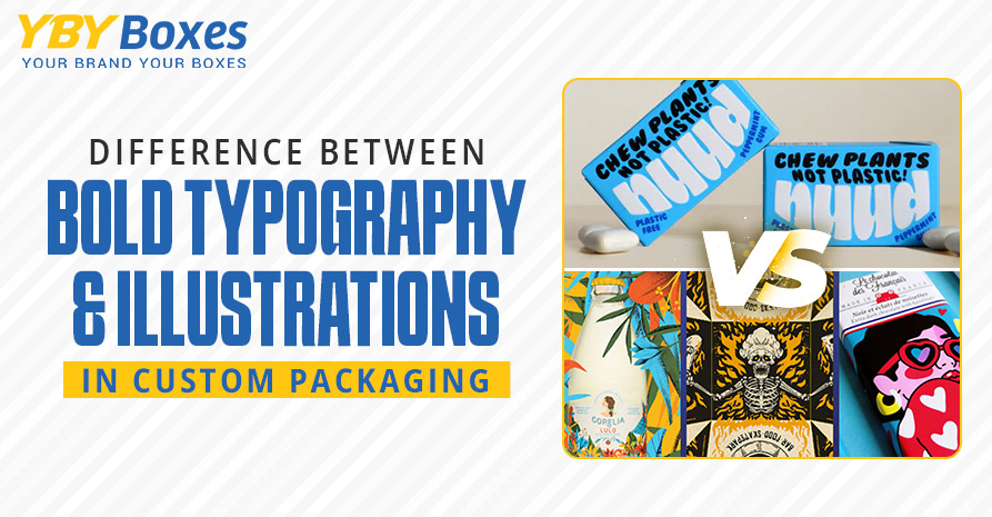
Big words. Strong fonts. Loud statements. This kind of design is like someone walking into a room and speaking confidently, not yelling, necessarily, but commanding the space.
Bold typography in custom-printed packaging does that. It tells you what the product is. What does it mean? Sometimes with just one or two words.
Like a coffee brand that simply says: “WAKE UP.” Or a candle box that just reads: “calm.” Lowercase. Minimal. But still bold in its own way.
Typography feels immediate. It’s fast and direct. And if you’re aiming for clarity or want your product to be instantly recognisable on a crowded shelf, it works. Especially when paired with a clean space and minimal distractions.
Still, you have to be careful. It can start to feel aggressive if overdone. Like it’s trying too hard to be cool. Or worse, like it’s talking at you instead of inviting you in.
Also, fonts carry weight. Not just literal thickness, but emotional tone. Sans-serif fonts might feel sleek and modern, while serif fonts (you know, the ones with little tails?) can feel more classic. Friendly. Literary, even.
So yeah, typography has personality. Sometimes more than you’d expect.
Totally different vibe.
Packaging illustrations are softer. More imaginative. They tell a story, or hint at one, even when the product inside is pretty straightforward.
Tea boxes with hand-drawn herbs. Snack bars surrounded by dancing cartoon almonds. Or that artisanal soap with line-art mountains and a tiny cabin in the distance.
There’s something a little nostalgic about illustration, right? Like it taps into your inner child or maybe reminds you of a book cover you used to love. It doesn’t need to explain itself. It just… let you feel something.
And honestly, that can be powerful.
Especially in custom-printed boxes. Because when something feels hand-crafted or expressive, it creates this unspoken promise that what’s inside is thoughtful too.
Still, illustrations aren’t always the answer. They can feel too playful, or even too busy, depending on the style. And if you’re targeting a sleek, modern audience? It might send the wrong message.
That said, combining both, now that’s where things get interesting.
Some of the most eye-catching custom packaging I’ve seen uses both.
Picture this: a box with a bold product name across the top. Clear. Confident. But around it, there’s movement. Maybe little scribbled stars. Or delicate line drawings curling up the side. It doesn’t overwhelm, it enhances.
When done right, bold typography grounds the design. It tells you where to look first. And the illustrations? They invite you to linger.
The key is balance. Let one lead, and the other support.
Too many elements fighting for attention? That’s when you lose people. Their eyes bounce around, and they put the box back down before ever making a decision.
So which one’s better?
Well, it depends. On your product. Your brand personality. Your audience.
If you’re all about directness like sleek skincare, modern supplements, maybe something a little techy typography might be your main character. It sends a message fast and clear.
But if your vibe is playful, artisanal, or even a bit whimsical? Packaging illustrations might carry more weight. They let you build a mood.
You don’t have to pick just one, though. Most great brands combine both.
And if you’re ever stuck, honestly, grab a few boxes you like from other brands and look at them. Flip them over. Run your fingers along the printing. Ask yourself why you were drawn to them in the first place.
At the end of the day, custom packaging is like a first date. You get one shot to make an impression. You want to look good, sure, but more than that, you want to feel like yourself. Authentic. Memorable. Worth picking up again.
Bold typography and illustrations are both tools. But they’re more than just design choices. They’re how you speak to the world without saying a word out loud.
So say it how you mean it. And if that changes later… that’s okay too. Most brands evolve. Yours probably will.