
-
 Office Timings Mon - Fri 09:00 am 5:00 pm
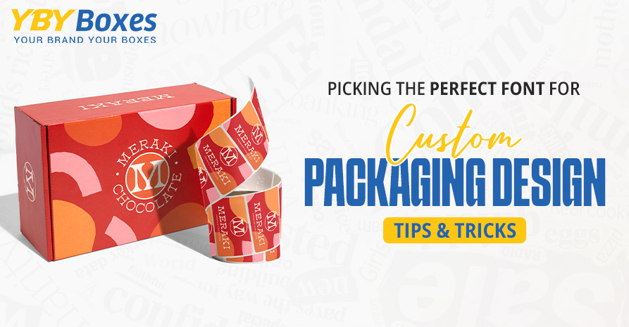
All the brands that exist today are competitive and dynamic. This is the reason packaging plays an imperative role in promoting products and boosting brand awareness.
Designs, shapes, colours, and layouts are all essential, but one of the features that is often underestimated is the perfect font for custom packaging design, you can say, packaging typography.
That’s why we have put this informative guide on font selection with secret tips & tricks that you didn’t know before. So let’s start from scratch.
Have you ever thought why packaging fonts are often ignored or why people don’t pay attention to them? The reason is simple: most brands think a picture can speak a thousand words. That quote could be applicable to many other things, but for packaging, things are quite different.
Struggling to choose the best font for packaging designs and labels? There’s no need to worry. With a few tips and tricks, you can easily come up with elegant typography that would be best suitable according to your target audience and packaging needs.
Brand personality directly impacts the selection of the right packaging font. That’s why it is essential to define it before choosing any font. The font you choose for typography must resonate with your target audience, including demographics.
Clarity is a key to developing customer trust towards your brand. We know it’s quite difficult to print a font and matching designs because of technicalities. Whichever font you want to use, make sure the text is easy to read under different lighting conditions. Make it bold and apparent in the right way.
Font pairing is yet another technical thing that cannot be done easily, but when done in the right way, it will surely be a magical thing. There is no need to stick to only one font. On the other hand, in some industries, there is a need to use 2 or more fonts. Make sure that fonts are easily matchable.
Limit variety by not using unnecessary fonts. It is crucial to use the number of fonts you really need. It is possible that you want to use a variety of matching fonts. Two or three of them are going to be enough. More than these could harm your brand image with unprofessional typography.
Don’t underestimate the power of readability. You should focus on readability, and it should not be neglected. The message you convey with textual content creates a strong & emotional connection between you and your brands, so readability must be high even if there is a need to sacrifice something else.
The right balance of hierarchy and simplicity is a must. Don’t make your packaging typography more complex for your customers. Strongly highlight the primary and secondary information, but that doesn’t mean the tertiary information should not be visible. Create a balance between both.
In the end, uniqueness and memorable experiences do leave. So, based on this phenomenon, put your efforts to use unique fonts that highlight your brand among other brands. There is no harm in doing competitor analysis, but make sure that your brand typography is far unique from your competitors.
We are so glad you got the chance to learn everything about selecting the perfect font for custom packaging design. Each tip we shared above is sufficient for different types of businesses. Consider other things like design elements, packaging size, and requirements of your target audience.
That way, it will be much easier to choose the adequate font for packaging designs and layouts. Lastly, do not forget to follow the latest market trends and make an analysis of changes that successful brands have made in the past.